
Guest Writer: 5 Tips For Making An Eye-Catching Poster
Posted by DonovanPoster advertising has been around for centuries. Of course, it has changed dramatically in styles and tones but it’s still around because it still works. So how do you create a poster that stands out in the crowd of advertising? Here, we’ll go over 5 ways to make that happen.
1. Color Pallet
Poster Design Example 1
This is probably one of the most obvious things to go over. That is why it’s crucial. Getting that bright or dull look depending on what your ad is for is very necessary. It’s what sets the tone. For example, if you’re advertising a ballet you’d go for something elegant and a rock show would have explosive color and dark tones. Blocks of color for retro-style ads or even gray and black tones for a more serious ad campaign. Your color choice is critical.
2. Visual hierarchy
If you are posting something with a lot of information, it’s important to have a big, bold title to catch the eye and make the lettering bold and interesting to look at. This will keep them reading. Group the information into blocks for easy reading. It’s important to guide their gaze where you want it. There are literally countless ways to do this. Remember, art and advertising are about guiding the people to you. The key is to guide their eyes to what you want them to see most without them realizing it.
3. Typography
Experiment with many fonts and styles to nail the look of your intended ad. With food, for example, you could write words with the actual food and have a clean, bold block of text on the image for easy reading of your advertisement. Draw in their attention with your creativity. Getting the writing on your ad to look just right is critical. You’d be surprised at the attention people pay to eye-catching lettering.
4. Location Importance
This tip is probably one of the most important rules to follow. Location, location, location. Getting the right permissions to have your fantastic ad posted in the right traffic and display areas will make or break your attendance goals. This is the most common sense tips and also the most overlooked. The rule of location is one of the most fundamental and oldest of them all. Walls next to ‘impulse buy’ sections are a fantastic area for this.
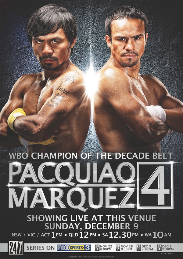
5. Less Can Be More

Poster Design Example 2
Learning to use negative (empty) space in the poster is a fun and creative way not only to guide the eyes but to cleverly do more with less. By forming the shape and leaving the inside blank it draws the eye into the negative space. This is a great way to bring their attention right to the text or to another image inside the empty space. It’s a fantastic way of creating something where nothing is there. It’s one of the oldest illusions in art to date.

Guest Writer: Jessica Kane
Jessica Kane is a professional writer who has an interest in graphic design, marketing, and printing. She currently writes for 777 Sign.