
Colour Guide : The Wheel
Posted by Obet Akris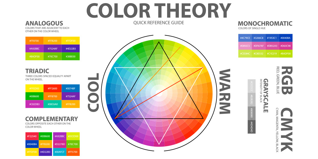
Colours are essential for artwork. A good color selection combined with meanings will make a good artwork (please see Colours: The Meaning). For beginners this will be quite challenging. Wrong colour combination will make a bad logo, too vibrant, pierce the eyes of your audience (please see Bad Logo Explained). Fortunately there is a guide you can use to do that easily.
Complementary
This is the colour combination you should try to avoid. It cancels each other, the colour of negative film. This combination will flip when you close your eyes, a good way to make your audience dizzy. To reduce this, try to add another colour close to any of the two chosen colours. This combination called Split Complementary, will give the same contrast but less tension.
Triadic
Triadic is also high contrast and too vibrant color combination. This combination will give a dramatic scene. Not as strong as Complementary Colour combinations, but these Triadic Colour combinations should be handled with caution. We can add space between each colour or use muted (lower saturation) colours. This method will tone down the drama but still give you the same meanings.
Analogous
Analogous colour combination looks like an old colour photograph. Usually this is the combination of three colours. Easiest way is to choose one color and the other two beside it.Try to use these combinations to make your artwork soft and mature with less tension. Reddish or yellowish colours will give a warm feel, and the bluish give cold. Greens and Purples are transitional colours, the feels are also transition. Greens feel warm but fresh like a tropical forest, Purples feel cold but warm like dawn or dusk.
Monochromatic
While analogous colour combinations use different colours to create a harmony, monochromatic colour combinations use the same colour but with different tones. We can say that if Analogous looks like an old colour photograph, monochromatic looks like a black and white photograph. There will be only a different tone. Darker tone called shades and brighter tone called tints.
see also: