Posted June 17th, 2020 by Obet Akris
Logos are everywhere. If you realize you can find them from when you’re awake till you’re going to bed. From your clock, cellphone, fridge, cereal box, car, card, etc. Everything from a business has a logo on it. Logo seems simple, but the creation is not as easy as people think.
There are 7 types of logos. Each type has its own advantage, so you need to consider what kind of logo you want before designing it.
Abstract Mark
image source: https://1000logos.net
Abstract Mark is a logo with symbols that is not easy to recognize as something we know. This type will need more explanation for people to understand, sometimes symbolizing something essential of the company. Usually designers make abstract symbols based on company philosophy, history, goals, or mission. Abstract marks condense your brand into a single symbol. This type of logo is often easy to remember but hard to recognize and associated. If you are setting up a new business with this logotype, please make sure to have a tagline that tells your business or associate with it.
Picture Mark
image source: https://1000logos.net
The difference between Picture and Abstract Mark is recognizability. This type of logo uses an icon of recognizable objects that symbolize something essential of the company, name, a proposition, history, works, etc. For example, apple computers use a bitten apple for their logo; not only because the name is apple but it is taken from another 2 philosophies. One is from Isaac Newton when he recognized gravity from a falling apple, “once fall can’t go back up”; once you fall in love with an apple product, you can’t go back to where you came from. Two is the bitten part from the Bible’s Genesis when Adam and Eve taste the forbidden fruit which some people considered as an apple. Once you taste it, it will open your mind and you will see everything.
Letter Mark
image source: https://1000logos.net
Lettermark can consist of one to several letters that cannot be read or can be read without meaning. Sometimes it is an initial, a monogram, or just a simple abbreviation of the company. Letter mark is the oldest type of logo which was previously used by the royal family to mark their belongings like house, cart, cattle, horses, swords, etc.; and also, by an artist to mark their works.
Word Mark
image source: https://1000logos.net
Word mark is a developed version of letter mark. Instead of just some designed letters, this type of logo can be read. The letter itself can be decorated and modified to match with company essential business. The chosen typeface should be correct to mitigate people’s misinterpretation of business. Wrong typeface selection will give people the wrong idea and the business may not be sold well, especially if it is a new business. Some well-known brands adopted the wrong typeface because of the trending typeface when they are born. For example, Sony that adopts Slab Serif typeface, makes it look far from their product. Luckily, they are already famous and the competition back then is not as tight as today. To learn more about typography please visit this link.
Mascot
image source: https://1000logos.net
A Mascot is simply an illustration that represents your company. This illustration is usually a character and symbolizes a company history or behavior. Think that a mascot is a company ambassador. Mascots are great for companies who want to target the family and children market. Think that a mascot can be made in real size and interacts in real life.
Emblem
image source: https://1000logos.net
An emblem consists of letters, words, numbers, or icons encapsulated into one shape. Think about badges, seals and crest. This logo can have a historical feel and striking impact for people. Thus they are often used by governments and schools or businesses with long historical backgrounds. This type of logo can have old looks or be modernized to fit the 21st century.
Combination
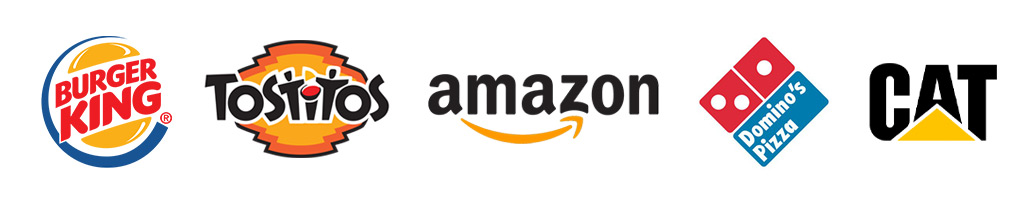
image source: https://1000logos.net
A Combination almost the same as emblem but non encapsulated into one shape. Text and Symbol are tangled together to form the logo but not connected each other. Therefore, they can’t be separated each other and stands on its own. In short, this logo consists of lettermark with additional mark (can be anything but not an emblem).
see also:
Posted June 17th, 2020 by Obet Akris
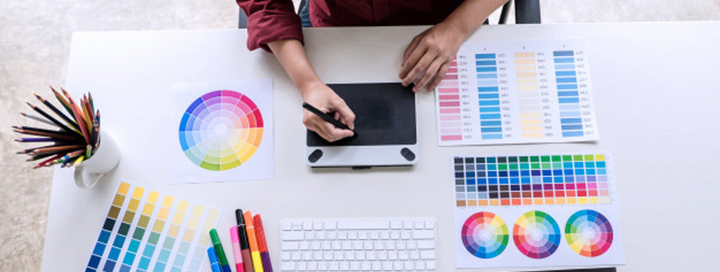
Choosing the right colours will make your business POP! Wrong combinations can give reverse effects. There is something called colour psychology which says colours can impact our emotions and behavior. This emotions and behavior based on our perceptions and historical experience, our senses and brain records everything and makes this called perception psychology. Choosing right colours for your Brands, Visual Marketing Theme, even Office Walls can affect people’s behavior who see it. This can be used for signage too. Please see the colour disc in this link if you need a guide to mix and match.
Black
Black is the absence of light. This color is as old as light itself. Black is luxurious, mysterious, bold, strong, simple, elegant, and powerful.
White
White is the presence of all light spectrums. White is pure, holy, clean, beginning, innocence and coolness. White also used for most modern brands which want a simple clean atmosphere.
Red
Red is associated with fire and blood. In the old times red was used for war flags. Red is health, passion, energy, bravery, love, desire, and determination. Other than that red gives most attention as it has the shortest wavelength. Red can be used to show warnings, dangers, and attentions.
Orange
Sweet and sour, red and yellow, that’s orange. Orange symbolizes creativity, joy, freshness, happiness, warmth, and compassions.
Yellow
The colour of sunrise. Yellow used to show prosperity and friendship. Yellow should be used with extreme cautions because it affects people a lot. Too much will make people impatient and too little will give people insecurity. However, you can have it in different tones like goldish or ochre which have more warmth, luxurious, mature, and comfort feels.
Green
As fresh as vegetables in spring. Green is a symbol of a healthy environment, earth, growth, freshness, nature, a new life, safety, fertility and wealth. Dark green will give more earthy, low profile feels. Be careful not to have yellowish dark green too much as it will give people rot and a dirty environment impression.
Blue
As deep as sea, as high as sky, as strong as waves, as striking as lightning, as calm as night. Blue has a lot of meanings as its tones. Dark blue is deep, calm and trustworthy. Vibrant blue symbolizes electricity, technology, and satisfaction. Light Blue symbolizes purity, peace, freedom and imagination.
Purple & Violet
Purple and violet is a rare sight in nature. It is mysterious, sacred, delicate and precious. In the other hand purple and violet are associated with venom, poison, dark magic and evil intention.
Pink
Soft, beautiful, and passionate. Pink is the “impossible colour”. Pink is made from red and violet spectrum which is the shortest and highest wavelength. Pink symbolizes love, passion, beauty, female, romance, and tenderness. Beware not to use too much vibrant pink as it will give people headaches. Make it softer for more romantic feminine and motherly feels.
Brown
Brown is the colour of earth. Wood and soil. Actually, brown is a muted dark orange colour. Brown is mature, royal, luxury, expensive, classy, vintage, and wealthy.
Gray
Actually, gray is light black. There are 3 types, cool grays (bluish), warm grays (Yellowish) and natural gray. Gray represents metals, silver, wealth, high technology, sharpness and trust.
see also
Posted June 17th, 2020 by Obet Akris
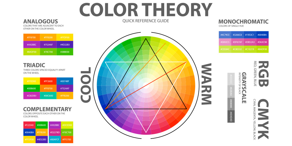
Colours are essential for artwork. A good color selection combined with meanings will make a good artwork (please see Colours: The Meaning). For beginners this will be quite challenging. Wrong colour combination will make a bad logo, too vibrant, pierce the eyes of your audience (please see Bad Logo Explained). Fortunately there is a guide you can use to do that easily.
Complementary
This is the colour combination you should try to avoid. It cancels each other, the colour of negative film. This combination will flip when you close your eyes, a good way to make your audience dizzy. To reduce this, try to add another colour close to any of the two chosen colours. This combination called Split Complementary, will give the same contrast but less tension.
Triadic
Triadic is also high contrast and too vibrant color combination. This combination will give a dramatic scene. Not as strong as Complementary Colour combinations, but these Triadic Colour combinations should be handled with caution. We can add space between each colour or use muted (lower saturation) colours. This method will tone down the drama but still give you the same meanings.
Analogous
Analogous colour combination looks like an old colour photograph. Usually this is the combination of three colours. Easiest way is to choose one color and the other two beside it.Try to use these combinations to make your artwork soft and mature with less tension. Reddish or yellowish colours will give a warm feel, and the bluish give cold. Greens and Purples are transitional colours, the feels are also transition. Greens feel warm but fresh like a tropical forest, Purples feel cold but warm like dawn or dusk.
Monochromatic
While analogous colour combinations use different colours to create a harmony, monochromatic colour combinations use the same colour but with different tones. We can say that if Analogous looks like an old colour photograph, monochromatic looks like a black and white photograph. There will be only a different tone. Darker tone called shades and brighter tone called tints.
see also:
Posted June 17th, 2020 by Obet Akris
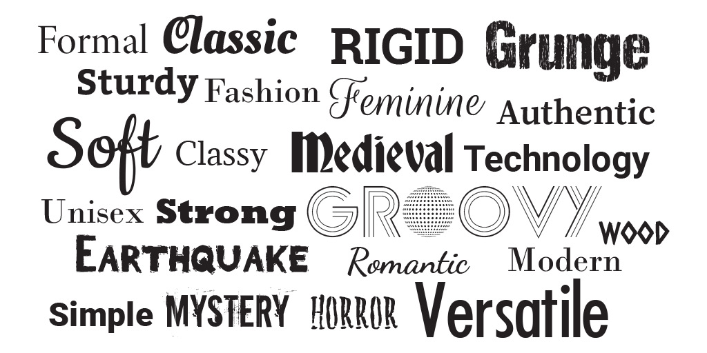
Typography is a study of letters. A set of letters called font. Just like colours, letters shape (called typeface) have their own character which radiate to the mind of the audience. Wrong typeface selection may give a wrong message to the audience, therefore they may not understand what your business is all about. There are 6 typefaces to choose.
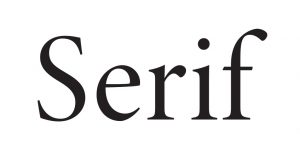
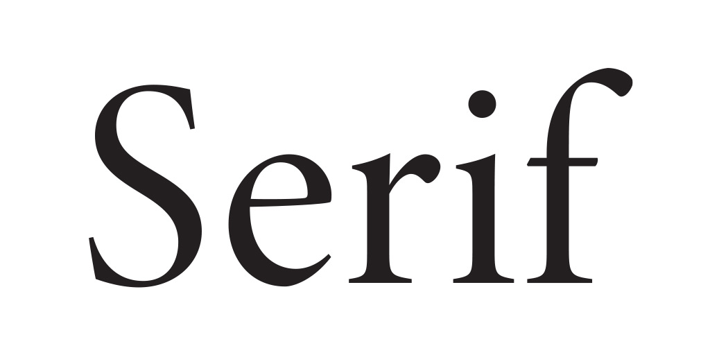
Serif
Serif typeface came from greek – romanian period when almost all letters are carved into stone or clay. To make it neater, letter artists that time create horizontal carvings at the end of each letter called serif. Serif typeface gives classy, smart, mature, formal, and elegant feels. Italic serif typeface gives romantic feels but still maintains its original feels. Bold serif typeface gives stronger and sturdy feels.
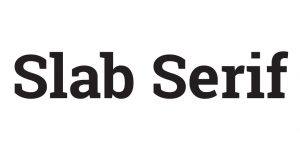
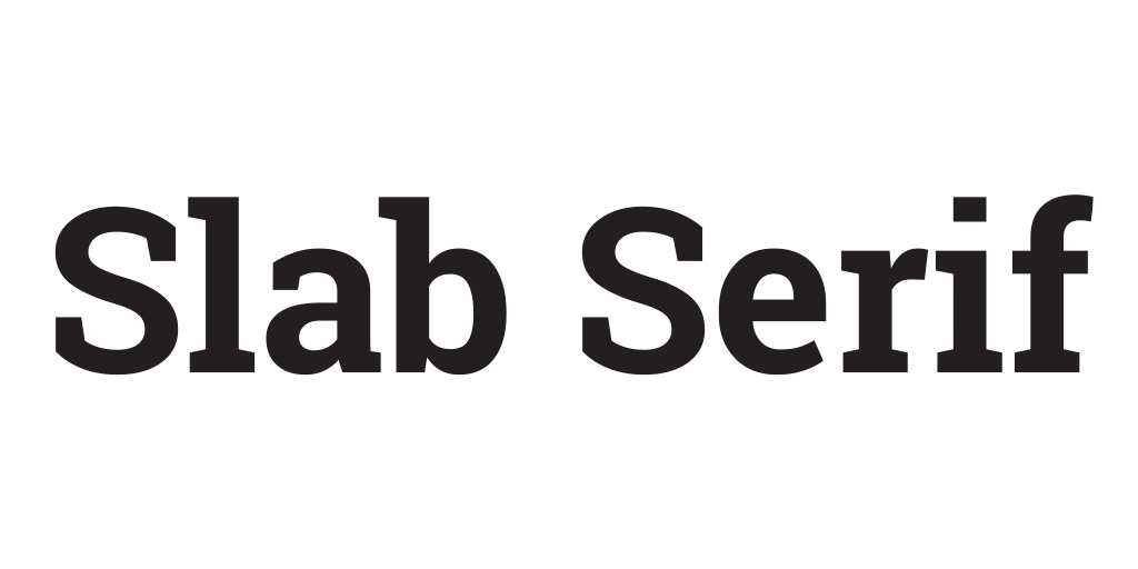
Slab Serif / Egyptian
A modification of Serif typeface. This is the typeface for those who want a strong, heavy and sturdy looking brand. This typeface is not suitable in italic mode as that mode will give unstable feels. This typeface came from building foundation shape. This typeface is suitable for building and construction companies, as well as building material suppliers.
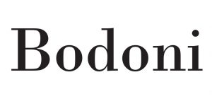
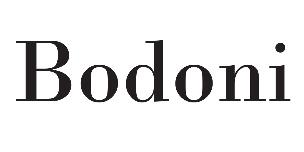
Bodoni / Modern Serif
Another modification of Serif typeface. This typeface is more feminine, elegant, and a little bit modern than regular serif. Please be careful as this typeface has an extreme thin to thick stem, it will be tricky to make it into 3D signage. This is the typeface of modern, unisex and fashion brands.
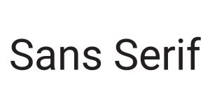
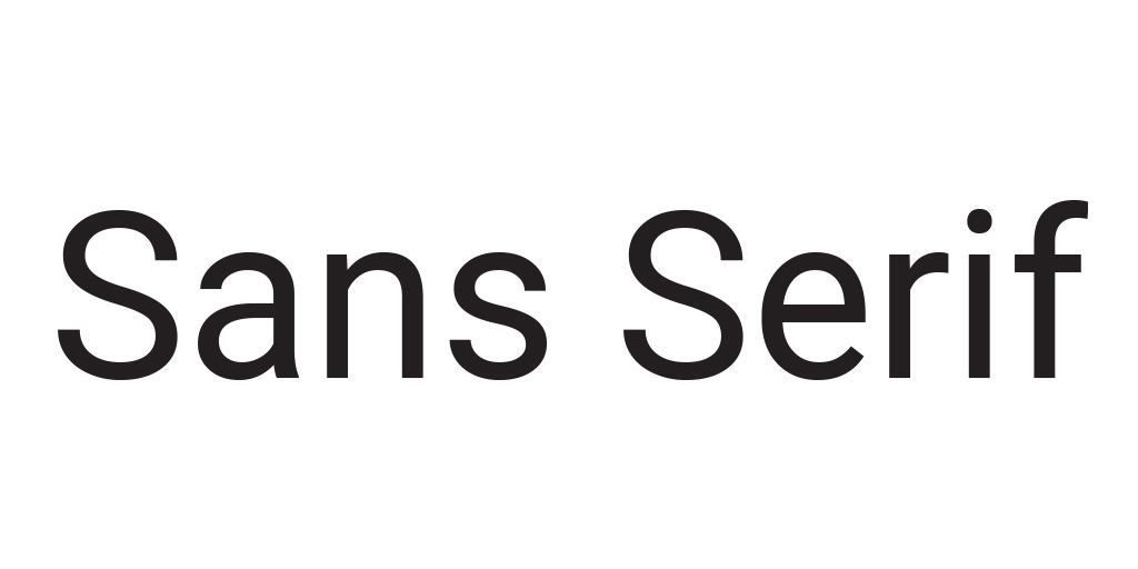
Sans Serif
Sans Serif typeface or simply called Sans is the most modern and versatile typeface. It is a simplification of Serif typeface. Sans typeface with medium weight will give modern, simple and sophisticated feels. Thin Serif typeface radiates feminine, romantic and flexibility. Bold serif typeface can be a replacement of slab serif. If your business is a high tech industry, this is the right typeface for you.
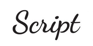
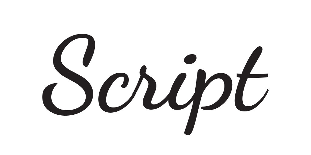
Script
Script typeface came from asian which used brush to write. Script is trending right now because of retro and industrial trends in interior designs. Script is romantic, feminine, classic, and elegant. Please take note that this typeface can’t be all uppercase.
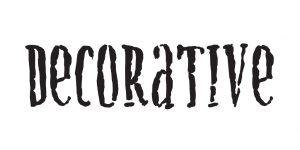
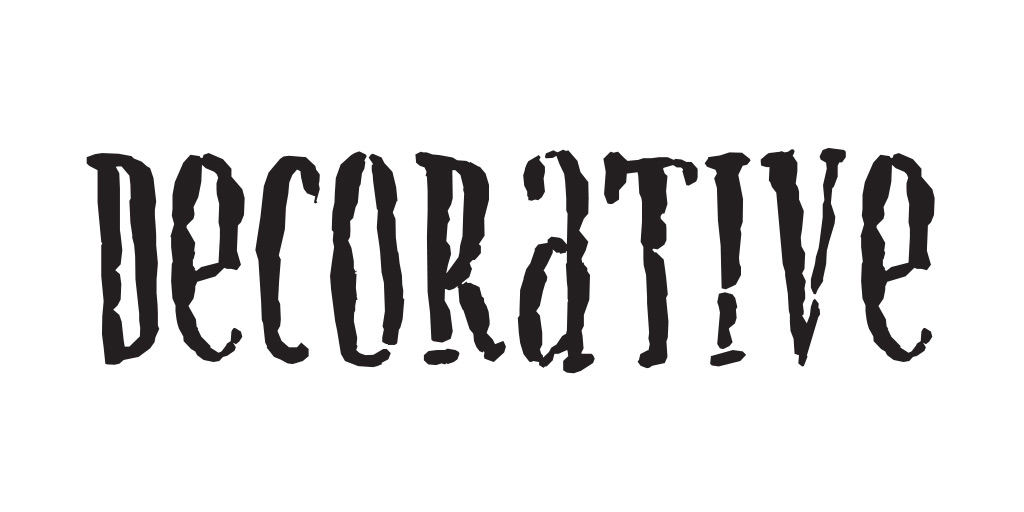
Decorative
Decorative typeface is the typeface that is made to meet specific requirements. The meaning can be very vast based on the shape itself. Decorative typeface can be made by combining a symbol or two into a letter.
The implementations of all of those characters above are not rigid, but can be used as guides. Because letters can form a word, typeface usage should match with that also. Words combined with typeface will give a strong message about your business and brand.
See also:
Posted June 17th, 2020 by Obet Akris
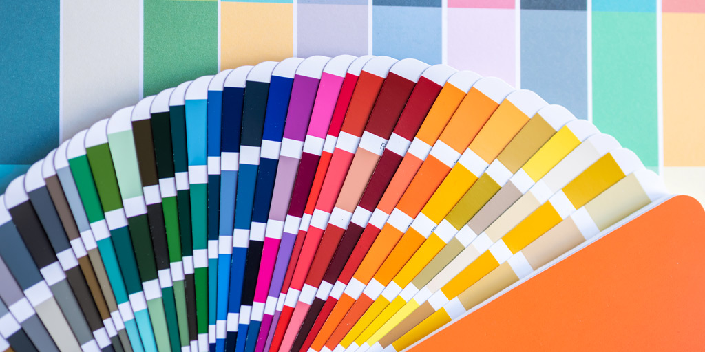
We see colours from the light spectrum, RGB (Red Green Blue). Monitors use this light to show colours using Hexadecimal code. Pigments like paint use CMYK (Cyan Magenta Yellow Black/Key) to make colours, millions of them. It will be hard to remake colours from CMYK, we need a defined colour book for guide in mixing paint. That’s when Pantone came in handy.
When you want to have painted signage like 3D Acrylics or Aluminiums, it is essential to have colours in Pantone code. There are several ways to convert your logo colours into Pantone, manually or digitally.
Manually – With Pantone Color Book
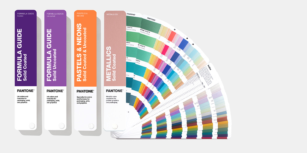
image source https://www.pantone.com/
You can purchase Pantone Color Book from art supply stores or design stores. Pantone sold their color books separately for each group. Please make sure you buy Pantone Solid Coated for smooth glossy finished and Pantone Solid Uncoated for non glossy finished. When you have the book, find the nearest colour available. This is the most accurate way but expensive and time consuming if you do not know how it works.
Digitally – Online
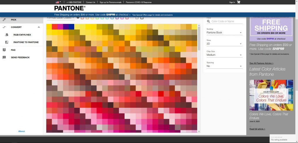
image source https://www.pantone.com/
There are plenty of websites which provide online color conversion from Hex, RGB or CMYK to Pantone. Officially you can use Pantone Color Finder service on their website. Just select the type, insert the code, and click convert. You will be provided with several matching (nearest) colours to choose. You can then provide the code to the signage company for painting. If you want to make sure what the colour looks like in real life, you can use google image search to find it. This method is the cheapest way, but may be inaccurate.
Digitally – Offline
Graphic Software like Adobe illustrator provide digital versions of Pantone Color Books. There are several sets of color books. You can also download and update colour books available with Pantone Software. In illustrator you can go to Edit – Edit Color – Recolor Artwork and select Pantone Color Book library. This is the fastest method if you have graphic software, but need a learning curve to use. The colour conversion may be quite accurate, but can be expensive if you do not have the software.
Please note that digital methods depend on your monitor colour. Every monitor has a different colour gamut, in simple words different monitors may show different colours for the same code. Low end monitors have 70% accuracy, Mid end monitors have 80-90% accuracy, and High end Professional monitors have 92-99% accuracy. Professional monitors are pricey, almost 10 times of mid end monitors price.
If you buy signage from us, we can convert your RGB, CMYK or Hex colour code to Pantone Management System colours for free. We are experts in colour conversion. We convert colours digitally and then check with the actual Pantone Color Books. Just give us your logo in vector format (.ai, .eps, .pdf, .cdr, or .svg), we will convert and check for you. This is the fastest, easiest, cheapest, effortless but accurate method.
See also:
Posted June 17th, 2020 by Obet Akris
Business is like dating. You need to attract people with your looks in this case your brand. “Don’t judge the book by its cover” they said, but in fact, books with ugly cover design are usually a bad book. That’s because they’re not trying their best to communicate their contents. Books with good cover design are not always a good book but at least they sell more.
A good logo will give a huge impact on the first impression your business is going to make. It gives customers information about your brand and helps them decide to work with your business. You really need a good professional made logo because it will be added to all of your branding materials. A good logo is not only good in graphic but also good in communication, tells what you stand for.
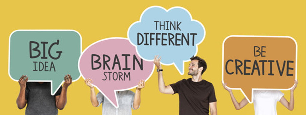
Idea
A logo should communicate your brand’s personality. And in order to get that you need to know your brand’s core. If you have partners, try to brainstorm with them to find the core. Once you already know that, make it into a single phrase like “My brand is…”. This will make everything easier to make because you already have the big idea. Core of any creative work is ideas. From that idea you can make the right symbol, typography, styles, colours, and everything else for your logo.
Visual Concept
Once you have the idea and determine the right style for your logo you can start from scratch. Yes, a sketch. You can get many inspirations from the internet and bookmark site like pinterest and google image. Please remember, do like an artist not a pirate.
Pirate robs and steals everything, artists do what we called SLIM, See Learn Imitate and Modify. See the logo you like, Learn the fundamental, Imitate the work, and Modify to suit our own. When you have logos you like, put them in one board, learn the fundamentals, and then try to sketch your idea based on your reference. In this step, just do it with your paper and pencil. Doesn’t need to be so neat, we can finish it later with the computer. Make it from line, and add blocks if needed. Never add colours, we need this black and white version. You can step aside text making as we can make that with a computer with stock font, but if your logo is a lettermark or wordmark, make sure you make that from scratch as it will act as your main subject.
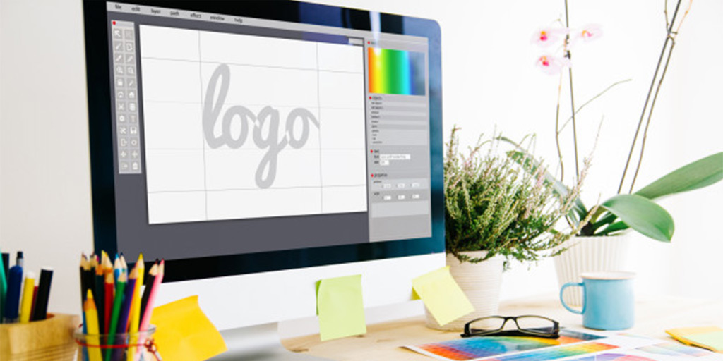
Get the Computer
Scan your sketch, and put it in your computer. There is plenty of software you can use. Whatever your operating system or your computer there will be a tool to do that. You can choose from free to premium software based on your budget. Free software has a steeper learning curve than premium one. Please make sure you make it in vector format, not bitmap (see the differences here)
Best free software for vector drawing is Inkscape (Linux, Windows, MacOS). It has vast customization and a good auto tracing engine. It will be a little bit difficult to control if you have a highly illustrative logo.
Best budget vector drawing software is Affinity Designer (Windows, MacOS, Ipad). It is the main challenger of Adobe illustrator in vector illustration. With USD 50 you can have easier control and interface than inkscape. But other than that, we only recommend Affinity Designer for illustration, not logo making.
In the middle there is Corel Draw. Price is higher, but much lower than Adobe illustrator. CorelDraw used in many countries as a substitute for Adobe illustrator. Controls almost the same like Inkscape and Affinity but easier.
Best Premium software is Adobe illustrator. It is expensive and has a subscription plan instead of one time buying. This is the software to use professionally with great support from its developer.
Our Recommendation: Please use Inkscape if you’re on budget. Learn from youtube and community. Instead of having Adobe illustrator and learn to use that, hiring a graphic designer will be less time consuming by a lot.
Colours
If you’re happy with the shape, now it’s time to add colours. You can choose up to 5 colours for your logo, but the ideal number is 3. You can use gradients but as you can see, even gradients can be separated into several blocks of colours.
Choose non standard colours, it means you can not choose from standard RGB or CMYK palette, you can use Pantone, Trumatch, etc. for help, but not the standard RGB/CMYK.
Convert your chosen colours into CMYK and Pantone for printing, and don’t forget to have Hex RGB Code for digital display. Please make sure you have them harmonized. Do not make overly contrast colours. If you need a guide how to select base colours please visit this link. Black or white background is considered as an element, not a colour.
Every colour has its own meaning. Please make sure you choose the right colours for communication. For example, blue and silverfish gray symbolize technology; Red is considered as bravery, warning, dangerous; White and light blue shows purity. Please see our colour meanings blog to know more about this.
Variant
Logo has some variants; we can not have one variant for all media. What you should have is a single coloured logo, logo on white, and logo on black. If you plan to have signage for your business, you will need 3D setup for your logo. You can learn more about it from this link. Everything else like layouts can depend on your logo style.
Conclusion: Logo is essential for your business. Having professionally designed logos will give a huge impact on how people look into your business. Logo making is not easy and cheap, you need extra time, effort, tools (high spec PC), and cost. Hiring professional logo making service is recommended when you have little time to make it.