
How to Make A Logo
Posted by Obet Akris![]()
Business is like dating. You need to attract people with your looks in this case your brand. “Don’t judge the book by its cover” they said, but in fact, books with ugly cover design are usually a bad book. That’s because they’re not trying their best to communicate their contents. Books with good cover design are not always a good book but at least they sell more.
A good logo will give a huge impact on the first impression your business is going to make. It gives customers information about your brand and helps them decide to work with your business. You really need a good professional made logo because it will be added to all of your branding materials. A good logo is not only good in graphic but also good in communication, tells what you stand for.
![]()
Idea
A logo should communicate your brand’s personality. And in order to get that you need to know your brand’s core. If you have partners, try to brainstorm with them to find the core. Once you already know that, make it into a single phrase like “My brand is…”. This will make everything easier to make because you already have the big idea. Core of any creative work is ideas. From that idea you can make the right symbol, typography, styles, colours, and everything else for your logo.
![]()
Visual Concept
Once you have the idea and determine the right style for your logo you can start from scratch. Yes, a sketch. You can get many inspirations from the internet and bookmark site like pinterest and google image. Please remember, do like an artist not a pirate.
![]()
Pirate robs and steals everything, artists do what we called SLIM, See Learn Imitate and Modify. See the logo you like, Learn the fundamental, Imitate the work, and Modify to suit our own. When you have logos you like, put them in one board, learn the fundamentals, and then try to sketch your idea based on your reference. In this step, just do it with your paper and pencil. Doesn’t need to be so neat, we can finish it later with the computer. Make it from line, and add blocks if needed. Never add colours, we need this black and white version. You can step aside text making as we can make that with a computer with stock font, but if your logo is a lettermark or wordmark, make sure you make that from scratch as it will act as your main subject.
7 Logo Types for Your Business
Get the Computer
Scan your sketch, and put it in your computer. There is plenty of software you can use. Whatever your operating system or your computer there will be a tool to do that. You can choose from free to premium software based on your budget. Free software has a steeper learning curve than premium one. Please make sure you make it in vector format, not bitmap (see the differences here)
Best free software for vector drawing is Inkscape (Linux, Windows, MacOS). It has vast customization and a good auto tracing engine. It will be a little bit difficult to control if you have a highly illustrative logo.
Best budget vector drawing software is Affinity Designer (Windows, MacOS, Ipad). It is the main challenger of Adobe illustrator in vector illustration. With USD 50 you can have easier control and interface than inkscape. But other than that, we only recommend Affinity Designer for illustration, not logo making.
In the middle there is Corel Draw. Price is higher, but much lower than Adobe illustrator. CorelDraw used in many countries as a substitute for Adobe illustrator. Controls almost the same like Inkscape and Affinity but easier.
Best Premium software is Adobe illustrator. It is expensive and has a subscription plan instead of one time buying. This is the software to use professionally with great support from its developer.
Our Recommendation: Please use Inkscape if you’re on budget. Learn from youtube and community. Instead of having Adobe illustrator and learn to use that, hiring a graphic designer will be less time consuming by a lot.
See our service in graphic design.
Colours
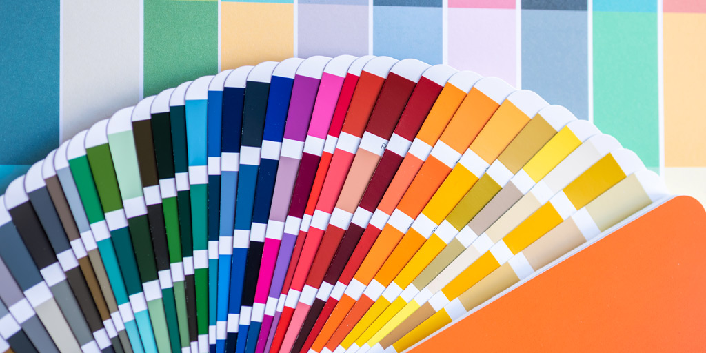
If you’re happy with the shape, now it’s time to add colours. You can choose up to 5 colours for your logo, but the ideal number is 3. You can use gradients but as you can see, even gradients can be separated into several blocks of colours.
Colour Guide : The Wheel
Choose non standard colours, it means you can not choose from standard RGB or CMYK palette, you can use Pantone, Trumatch, etc. for help, but not the standard RGB/CMYK.
Convert your chosen colours into CMYK and Pantone for printing, and don’t forget to have Hex RGB Code for digital display. Please make sure you have them harmonized. Do not make overly contrast colours. If you need a guide how to select base colours please visit this link. Black or white background is considered as an element, not a colour.
Pantone Management System for Signage Making
Every colour has its own meaning. Please make sure you choose the right colours for communication. For example, blue and silverfish gray symbolize technology; Red is considered as bravery, warning, dangerous; White and light blue shows purity. Please see our colour meanings blog to know more about this.
Variant
![]()
Logo has some variants; we can not have one variant for all media. What you should have is a single coloured logo, logo on white, and logo on black. If you plan to have signage for your business, you will need 3D setup for your logo. You can learn more about it from this link. Everything else like layouts can depend on your logo style.
Conclusion: Logo is essential for your business. Having professionally designed logos will give a huge impact on how people look into your business. Logo making is not easy and cheap, you need extra time, effort, tools (high spec PC), and cost. Hiring professional logo making service is recommended when you have little time to make it.