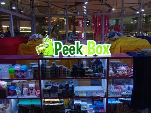
Many people have a true love for vintage and retro design. Even though a vintage design looks ‘old-fashioned’, but its aesthetic design styles give you the nostalgia of your good old memories. For millennial youngsters, you don’t have to live through an era to understand its aesthetic design. Some even consider this vintage design as fashionable and eye-catching.
Vintage signage is also beneficial, potentially even essential for certain businesses allowing your message to stand out. With vintage signage, you can entice people to your message in an authentic and creative manner. Its unique and interesting designs allow you to encapsulate an entire tone, feeling, and notion, levelling up your signage to go above and beyond just displaying information or a brand. Here, we’d like to share 3 important elements in creating vintage signage.
1. Appropriate fonts
For a good vintage signage, you need good vintage style fonts. The right font will reinforce your brand and image. When it comes to readability, it is important to pick a background color that helps the font stand out. Also, consider your audience. Make sure people can read your sign without too much squinting and effort.
Note that there are a lot of fonts that will bring an aged feel to your designs, but high quality free fonts are hard to find – especially when it comes to vintage style fonts. Why bother yourself? In Maneki Signage, our professional designers are ready to help you choose the best vintage style font for your signage. Below are some samples of the popular vintage style fonts:
(Hominis Font)
(Retrock Font)
2. Color choice
Your color choice can change a modern design to something inspired by past years. Many vintage signs are rendered in bright colors. In the 1950s design, colors were often muted with reds, teals, mints, and taupe tones being used often. Using these colors in your design is beneficial when you are trying to make it obviously inspired by the decade to your audience or clients. In the 1960s design, pastel colors were more popular. While neons and light bulbs were often used in the 1980s and 1990s.
Source: Pexels (Alexas Fotos)
Source: Pexels (Snapwire)
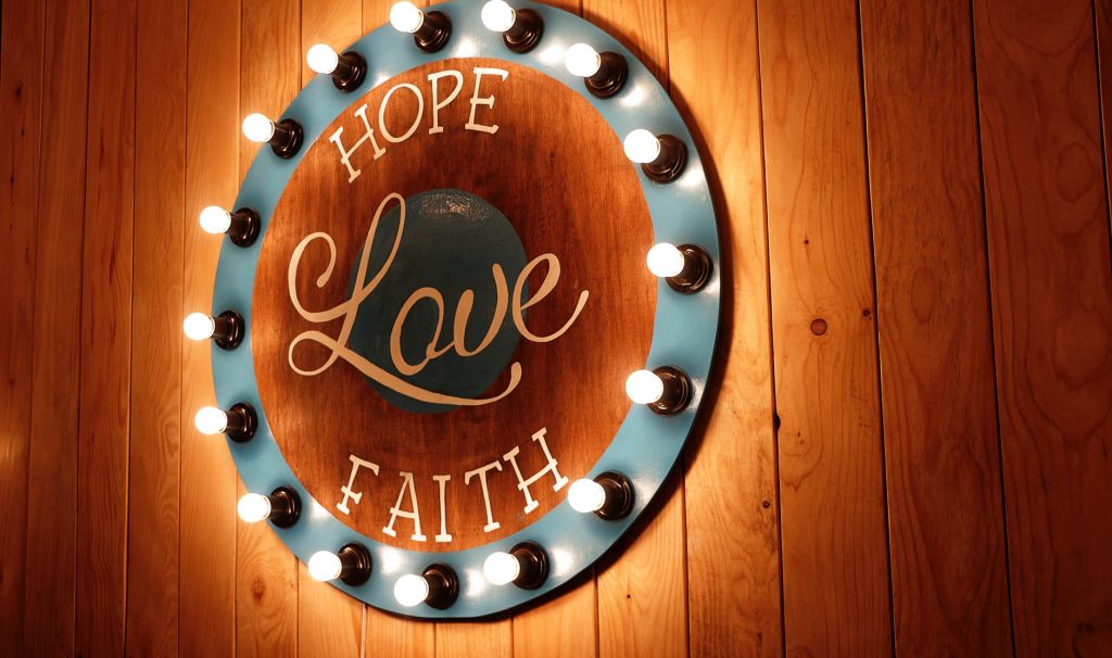
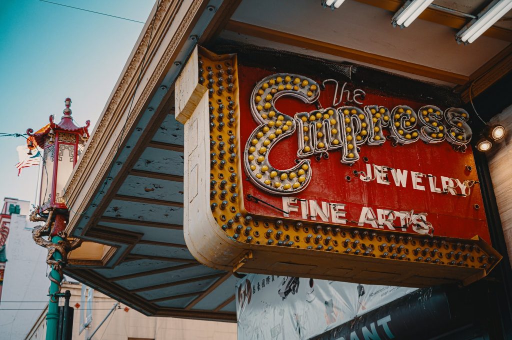
3. Vintage-style bulbs
Vintage-style bulbs were once popular at diners, movie theatres and casinos. You could see them being used as chase lighting or even in open-faced channel letters. Vintage-style bulbs started out as a nostalgic novelty for people who weren’t ready to say goodbye to the incandescent bulbs getting phased out by the rising energy standards. These bulbs are often intended for exposed bulb setups, they are made to be looked at. For that reason, a lot of them are intentionally less bright or even looked yellowy. Most vintage-style bulbs use the color temperature way down in order to boost up the old-school aesthetic.
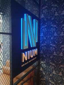
The main thing about signage is that you want it to be noticed by people. You may wonder how to make sure your signs are noticed. The answer to that, is to light them up. This illuminated signage may cost you more money than those without lighting, but it helps customers to easily notice and see the purpose of the sign. You will also get some other benefits from illuminated signage such as: provide good visibility at night, provide lighting in a certain area regardless of weather conditions, perfect for product or brand promotions, and help potential customers to see the information provided on the sign. All the more reasons to make it worth the extra money.
One essential thing you need to know about illuminated signage is that there is more than just a simple light behind them. It’s a simple fact that light can change the appearance of any given color. To help you get a better understanding before lighting up your signage, we have put together our guide on how color of lights affects the final outlook of signage.
The color temperature of LEDs determines whether white light will have a yellowish or bluish color. The color temperature is measured in Kelvins (K). For example, warm white LED is around 2700K to 3200K, daylight is between 4000K to 4500K, and cool white is between 5000K to 6200K.
Warm White LED
(Maneki Signage – Wooden lightbox with warm white LED)
Warm white LED provides a more soft, yellowish color. It is the closest color match to soft white incandescent lighting and is the most popular option for indoor illuminated signage. However, at a given wattage, warm white LED light fixtures have a slightly lower lumen output and won’t be quite as bright as an LED fixture with cool white LEDs, nor as bright as the incandescent lighting.
(Maneki Signage – Gold SS backlit letters with warm white LED)
Warm white LED is more relaxing to the eyes than cool white. It is best for rooms or areas where people naturally prefer soft light, and it is also ideal for setting warm and cozy atmospheres. Warm white LED is more popular for indoor signage as the glow they generate is bright enough without hurting your eyes.
Cool White LED
(Maneki Signage – 3D aluminium lightbox with cool white LED)
Cool white LED provides a brighter, bluish-toned color. Cool white LED lights produce a much cooler and vibrant white color. For a more modern and cleaner look, cool white LEDs are perhaps the best choice, giving a clear and fresh glow to any space they illuminate. With their bright white glow and slightly bluish color, cool white LEDs are perfect for areas that require alertness for outdoor signage.
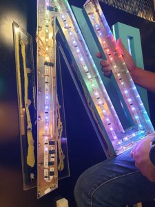
RGB LED
(Maneki Signage – Installation of RGB LED)
RGB stands for “Red, Green and Blue”. RGB is called an additive color system because the combinations of red, green, and blue light create the colors that we perceive by stimulating the different types of cone cells simultaneously. We use RGB LED for colored lighting. RGB LED enables you to create millions of different colors of light, all based on these three primary colors. With the help of RGB LED, you can make your illuminated signage more eye-catching.
(Maneki Signage – 3D aluminium channel letters with RGB LED)
The advantages of choosing illuminated signage vary depending on the purpose of the sign. However, this is something important to think about before you make a decision about the type of signage you are going to use for your business. Although the benefits of Illuminated signs are undeniable for businesses, the elements to consider may be different depending on the purpose of the sign and the type of business involved.
There are many types of signs out there. Choosing the best one for your specific needs may be easier if you consult an expert. We will be pleased to provide comprehensive advice and to recommend a design tailored to your environment and your budget. Contact us to learn more about custom illuminated signage solutions!
Everyone knows that wood makes great signage! Wooden signages have been around for years and have been used by many companies from startups, successful companies, even personalized signage for your home. Wooden signages with custom lettering, engraving, images, and quotes are very popular. The interesting patterns and features in wood highlight the quality of the sign. Of course, durability is guaranteed. With the right maintenance, wooden signages could last throughout your lifetime.
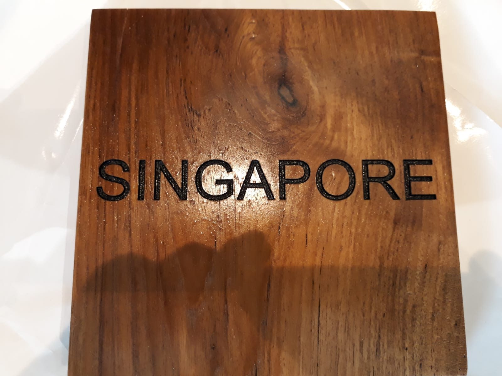
Nowadays, wooden signages are applicable for Building Signs, Monument Signs, Restaurant Signs, Residential Signs, Shop Signs, Wall-mounted Signs, Menu Signboard, Home Décor, and many more. Here, we’d like to share 5 types of wood commonly used for signage in Singapore.
1. Chengal Wood
Maneki Signage – Wooden Sign (Chengal Wood)
Chengal wood is one of the popular materials for outdoor signage due to its durability. Its sturdy material ensures that the signage does not get damaged easily when exposed to harsh wеаthеr conditions, making it perfect as outdoor signage in Singapore’s tropical climate. Wooden signages have both aesthetic and financial value, and there is nothing as elegant and stunning as Chengal wood signage that surrounds your property.
2. Nyatoh Wood
Maneki Signage – Wooden Sign (Nyatoh Wood)
It is well-known that Nyatoh wood considered as a workable and useful hardwood. It can be used to make so many things such as furniture, interior joinery, plywood, utility construction, and signage. Nyatoh wood is not particularly attractive, but it is very common and well-liked in Singapore and some other South East Asia’s countries. Nyatoh wood looks reddish as raw material, but most types are easy to work with and takes to stain and polish well. Hence, it is popular to be used as indoor signage.
3. Ash Wood
Maneki Signage – Wooden Sign (Ash Wood)
Another versatile and popular wood for signage in Singapore is Ashwood. Its light coloured and smooth-grained, make this wood a favourite choice for fine furniture, floors, sports equipment, tool handles, and signage. Ashwood is also durable, lightweight, and aesthetically pleasing. It can also make great signage with its natural colour and mostly used for indoors.
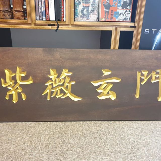
4. Teak Wood
Maneki Signage – Wooden Sign (Teak Wood)
Teak wood is very popular not only in Singapore but also across the world. What is it that makes Teak wood so desirable? It is known for its incredible durability, elegance, and water resistance. Due to its adaptability to extreme weather and water resistance, Teak wood is an excellent choice for shipbuilders, outdoor furniture, and outdoor signage. It means that it can provide a lifetime and more of use indoors.
5. MDF
Maneki Signage – Wooden Sign (MDF)
MDF (Medium Density Fiberboard) is another popular material for wooden signage in Singapore. It is an engineered composite material, cost-effective, and good for painting as it has a smooth surface. We can easily customize this material with a standard, rounded, or bevelled edge to meet your specification. MDF is often considered a level above plywood because it is denser, stronger and more durable. However, it is not as durable as the other solid woods. We recommend MDF to be used only for indoor. If you are looking for a cool vintage sign yet pocket friendly, MDF is the perfect choice for you.
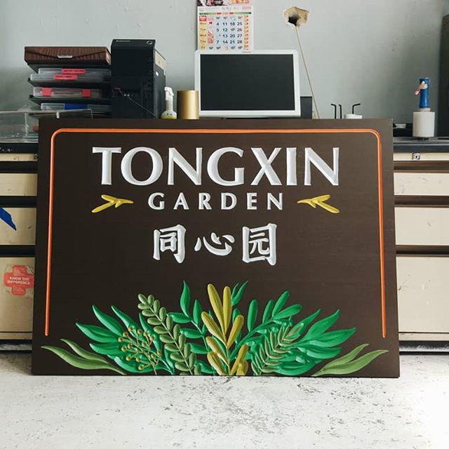
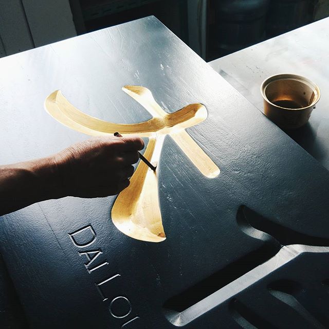
Maneki Signage – Wooden Sign painting process
Some of the ways to get perfect signage besides using high-quality materials, are to take the time to sand, stain, and paint the wood correctly. In Maneki Signage, we have the professional craftsmen who are an expert in both spray-paint and hand-paint technique. Whether you prefer a spray-paint or hand-paint, we will make the final paint finish on your signage look best!